Button
Buttons are touchable elements used to interact with the screen and to perform and operation. They may display text, icons, or both. Buttons can be styled with several props to look a specific way.
Usage
Variants
There are solid button, outline button and clear button types
<Stack row align="center" spacing={4}>
  <Button title="Solid" />
  <Button title="Outline" type="outline" />
  <Button title="Clear" type="clear" />
</Stack>
Size
Button can be small medium or large
<Stack row align="center" spacing={4}>
  <Button size="sm">Small</Button>
  <Button size="md">Medium</Button>
  <Button size="lg">Large</Button>
</Stack>
Colors
<Stack row align="center" spacing={4}>
  <Button>Primary</Button>
  <Button color="secondary">Secondary</Button>
  <Button color="warning">Warning</Button>
  <Button color="error">Error</Button>
</Stack>
Disabled
<Stack row align="center" spacing={4}>
  <Button title="Solid" disabled />
  <Button title="Outline" type="outline" disabled />
  <Button title="Clear" type="clear" disabled />
</Stack>
Linear Gradient
<Button
  ViewComponent={LinearGradient} // Don't forget this!
  linearGradientProps={{
    colors: ["#FF9800", "#F44336"],
    start: { x: 0, y: 0.5 },
    end: { x: 1, y: 0.5 },
  }}
>
  Linear Gradient
</Button>
Icon Button
Can contain an Icon by setting the icon prop or placing an Icon component within the Button.
<Button radius={"sm"} type="solid">
  Save
  <Icon name="save" color="white" />
</Button>
Loading spinner
<Button title="Solid" type="solid" loading />
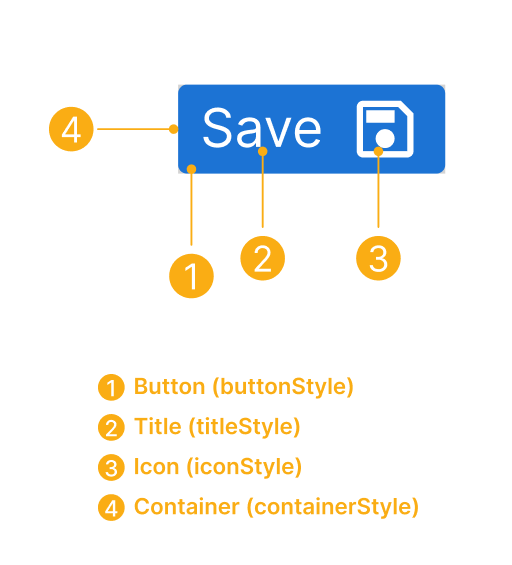
Anatomy
Props
note
Includes all TouchableOpacityProps props.
| Name | Type | Default | Description |
|---|---|---|---|
TouchableComponent | typeof Component | Component for user interaction. | |
ViewComponent | React Component | Component for container. | |
buttonStyle | View Style | Add additional styling for button component. | |
color | string | primary | secondary | success | warning | error | Color of Button | |
containerStyle | View Style | Styling for Component container. | |
disabled | boolean | false | Disables user interaction. |
disabledStyle | View Style | Style of the button when disabled. | |
disabledTitleStyle | Text Style | Style of the title when disabled. | |
icon | IconNode | Displays a centered icon (when no title) or to the left (with text). (can be used along with iconRight as well). Can be an object or a custom component. | |
iconContainerStyle | View Style | Styling for Icon Component container. | |
iconPosition | top | right | bottom | left | left | Displays Icon to the position mentioned. Needs to be used along with icon prop. |
iconRight | boolean | false | Displays Icon to the right of title. Needs to be used along with icon prop. |
linearGradientProps | object | Displays a linear gradient. See usage. | |
loading | boolean | false | Prop to display a loading spinner. |
loadingProps | ActivityIndicatorProps | Add additional props for ActivityIndicator component. | |
loadingStyle | View Style | Add additional styling for loading component. | |
radius | number | sm | md | lg | xs | Radius of button |
raised | boolean | false | Add raised button styling (optional). Has no effect if type="clear". |
size | sm | md | lg | md | Button size |
title | string | ReactElement<{}, string | JSXElementConstructor<any>> | Add button title. | |
titleProps | TextProps | Add additional props for Text component. | |
titleStyle | Text Style | Add additional styling for title component. | |
type | solid | clear | outline | solid | Type of button. |
uppercase | boolean | false | Uppercase button title |